| Entrance | Mainstreet | Wiki | Register |
|
# of watchers: 11
|
Fans: 0
| D20: 15 |
| Wiki-page rating |  Stumble! Stumble! |
| Informative: | 0 |
| Artistic: | 0 |
| Funny-rating: | 0 |
| Friendly: | 0 |
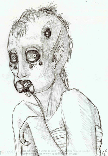
2010-05-18 [Chel.]: I think you are really going in a good direction with how the neck is rendered. I think if you did this again to the face plates, it would look awesome.
I think the background needs to be a bit smoothed out to make the figure pop too.
Other then that, it's really weird(in a good way). Again, I love how the neck is rendered, specifically those two metal pole things on the sides of the neck with the rims around them. :)
2010-05-19 [NOOOPE]: I like the roughness, personally. It gives it a quick spontaneous feel like a figure study. But it's a robot... which makes it rock. The face area seems a wee flat though.
2010-05-19 [arthemis_]: The neck is the best part of this picture. I love the lines for the head, but maybe it needs a bit of shading too. I'm not a robot person, I've no idea to make the material pop out more. Maybe if you get rid of the halo around the face? I don't know. I admire the shading on the lower part, it's amazing!
2010-05-20 [The Dizzy Raven]: The shading is magnificent!!!
2010-05-20 [Pnelma Tirian]: boredom, mostly XD I wanted to draw something complex but not complicated, like a human face would be.
2010-05-20 [Falx]: I like the detail work on the neck. What medium did you use?
2010-05-20 [Pnelma Tirian]: graphite. I think it was a lead pencil. XD
2010-05-20 [Falx]: Wow! Double grats then. I know how hard it is to make pencils make things look metallic and shiny.
2010-05-20 [pegasus1000]: Good start to a great android.
2010-05-20 [The Dizzy Raven]: Haha ^_^ I understand you there. Sometimes, artists create the most fantastic things out of boredom. It works that way a lot
2010-06-12 [Chel.]: I love the pose.... and the wings in front being in a lot of dimension. :3
I don't really have any constructive crit...other then I would love to see color on this thing!
2010-06-12 [arthemis_]: I love the abs, I love the pose. I am not such fan of the aureole thing as it's too Christian-ish for me. Also it seems that the wings in front could use a little more shading work. Great concept, don't quite like the text.
2010-06-13 [pegasus1000]: The realistic aspect of the abs and arms are a weird contrast to the cartoonish face and sketchy wings. I would love to see you put more work into the wings and bring them up to the quality of the body (Especially the lower wings) There is a lot of potential for this picture and I hope you keep working on it.
Number of comments: 33 | Show these comments on your site |
|
Elftown - Wiki, forums, community and friendship.
|